Uber Samba
Design System
Samba is the design language for uber.com’s web content management system. It is used by teams across the company, and enables a unified Uber brand across all their products. As HAUS’ sole UX designer integrated into Uber’s web team, I have had the opportunity to not only use Samba but also improve it. Below are some of my contributions to the Samba design system.
Role
Product Designer
Team
Uber's web team
Duration
Ongoing
Platform
Responsive web
Web Page Designs
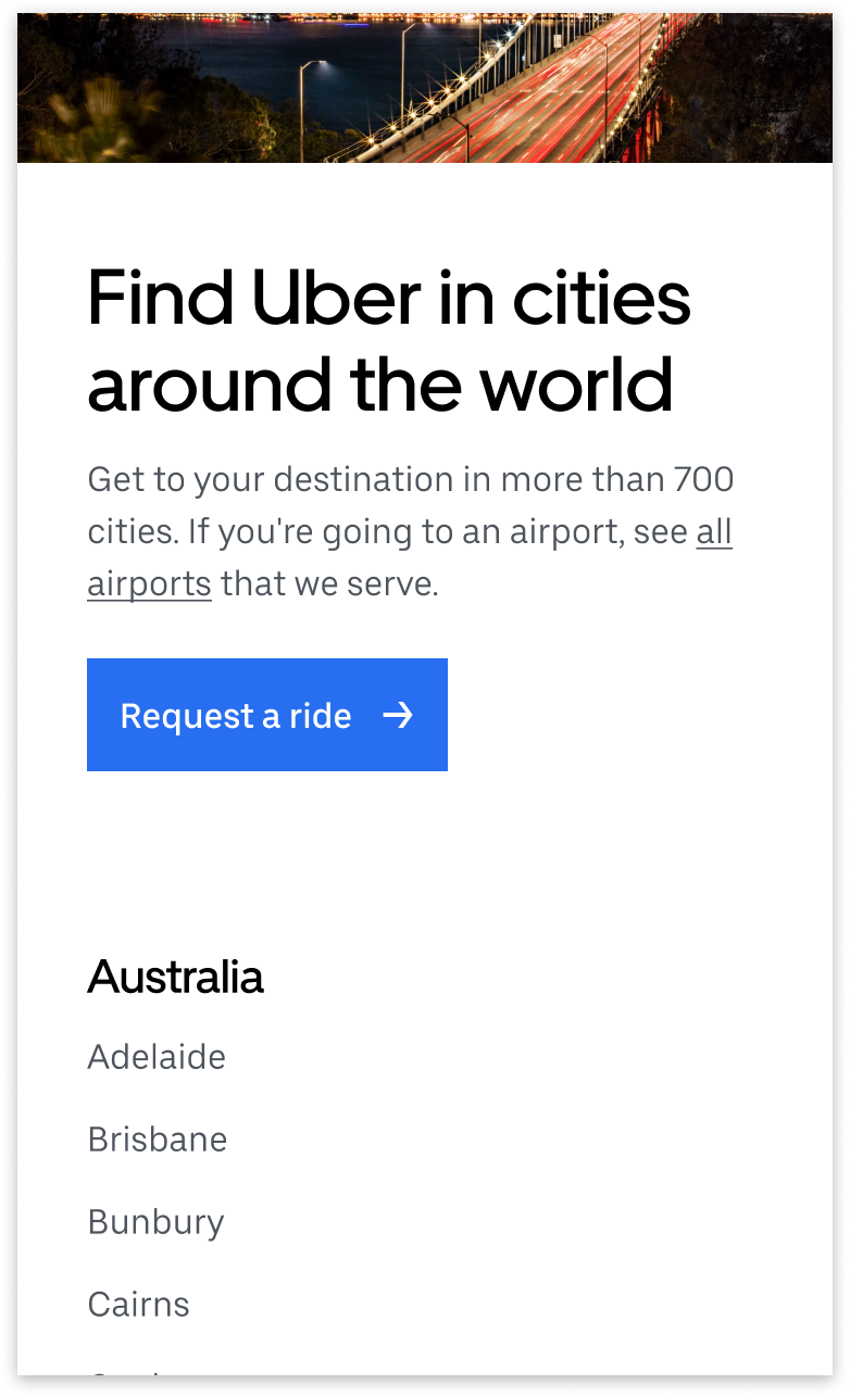
I have collaborated with product managers, engineers, and stakeholders to design 30+ pages for uber.com using the Samba design system. One of the designs I worked on was the cities page, which served as the template for all 700+ cities that Uber operates in.
Block Designs
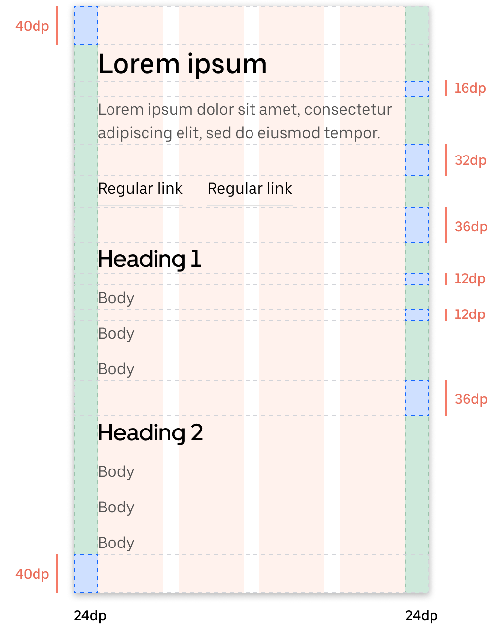
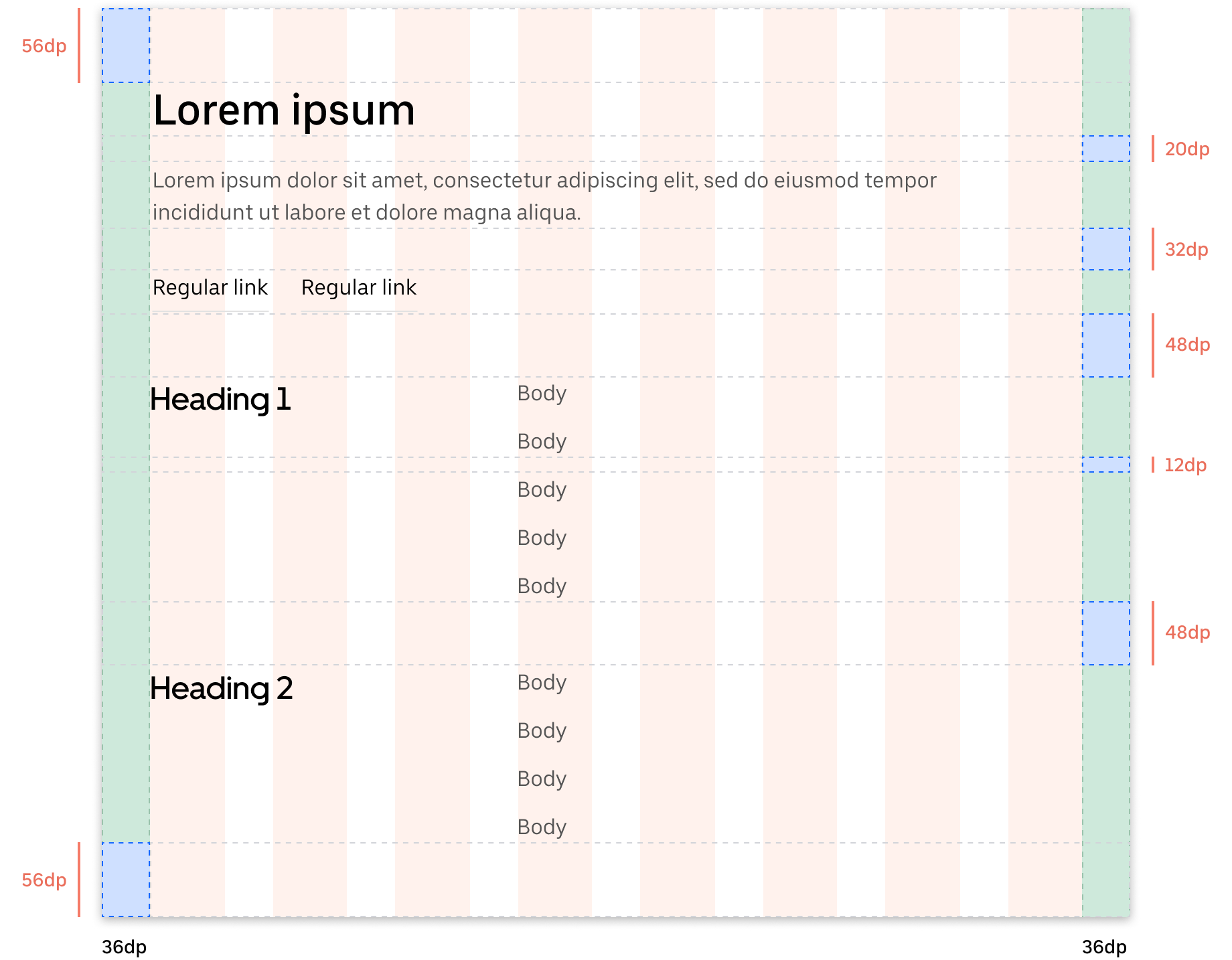
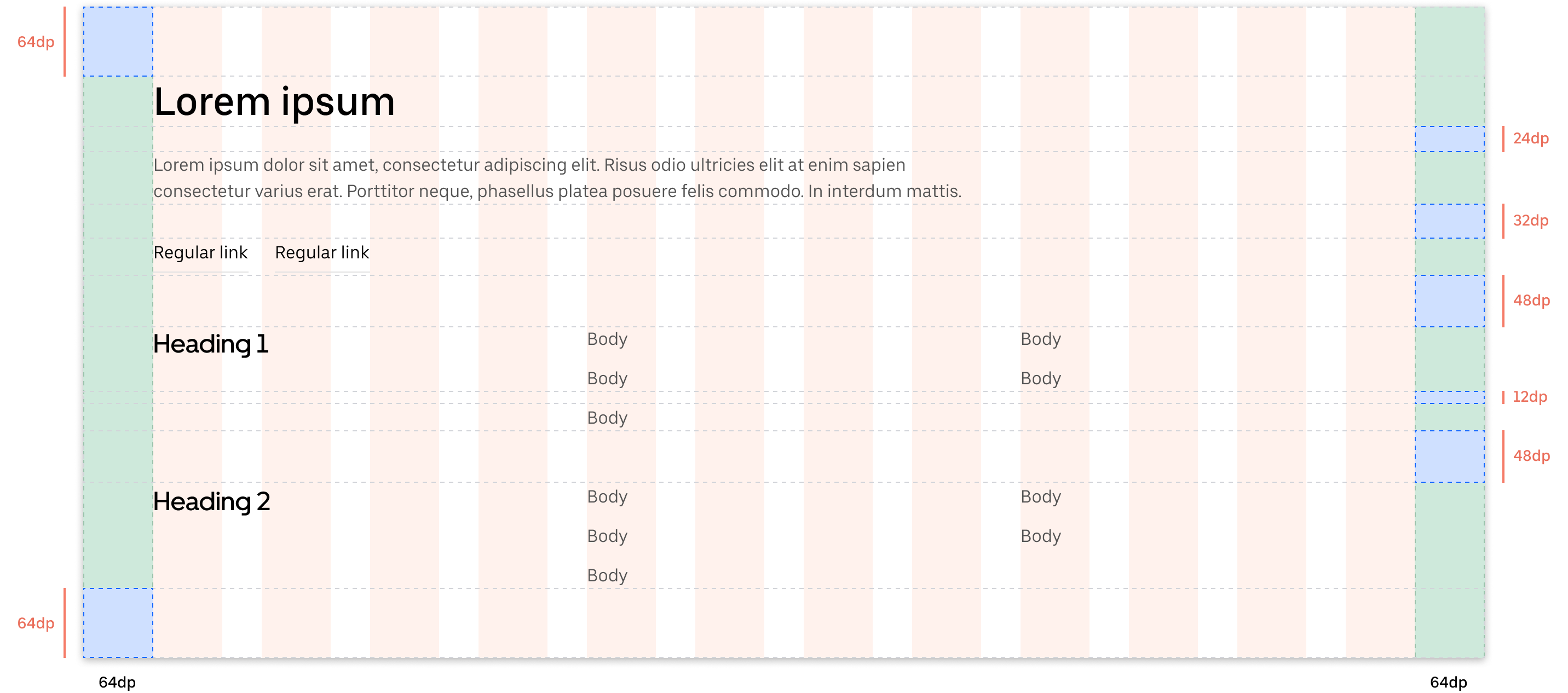
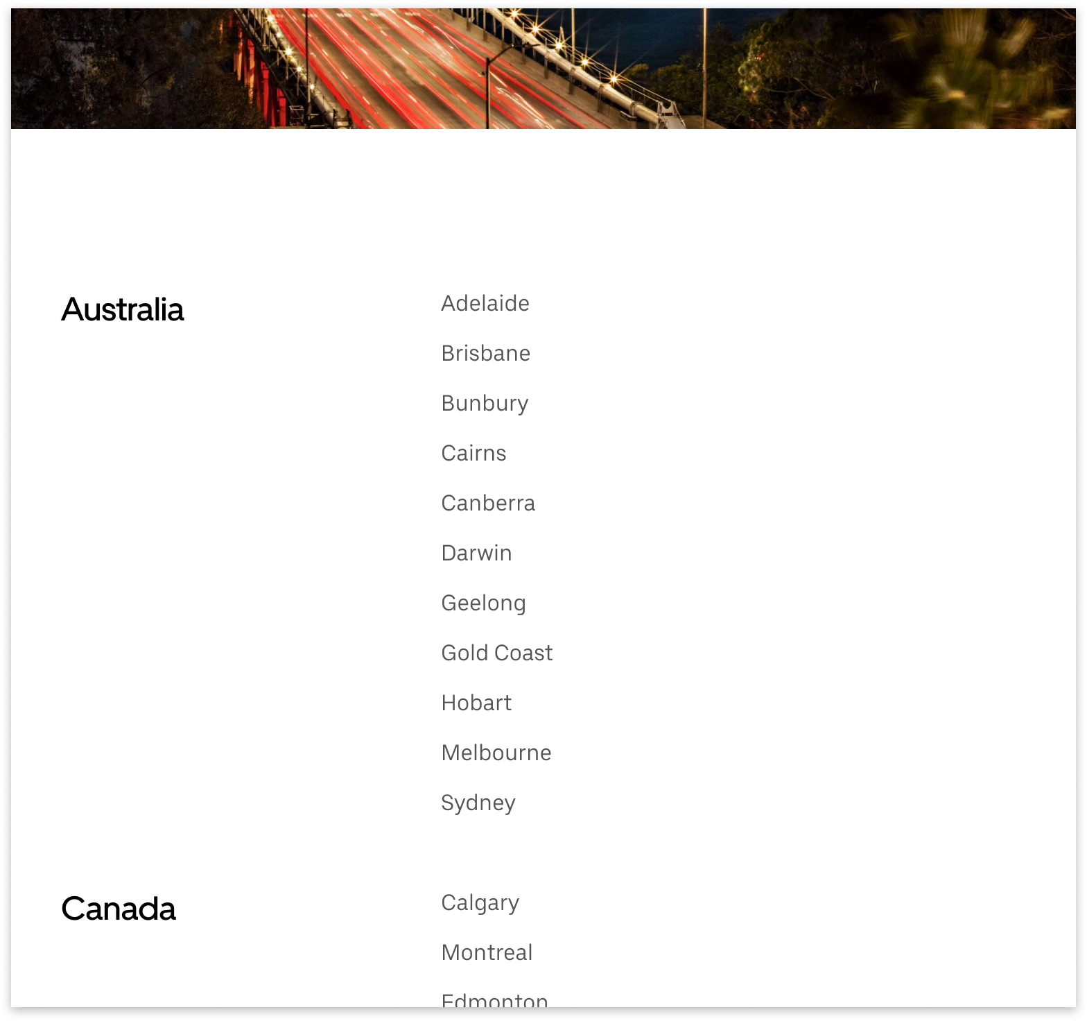
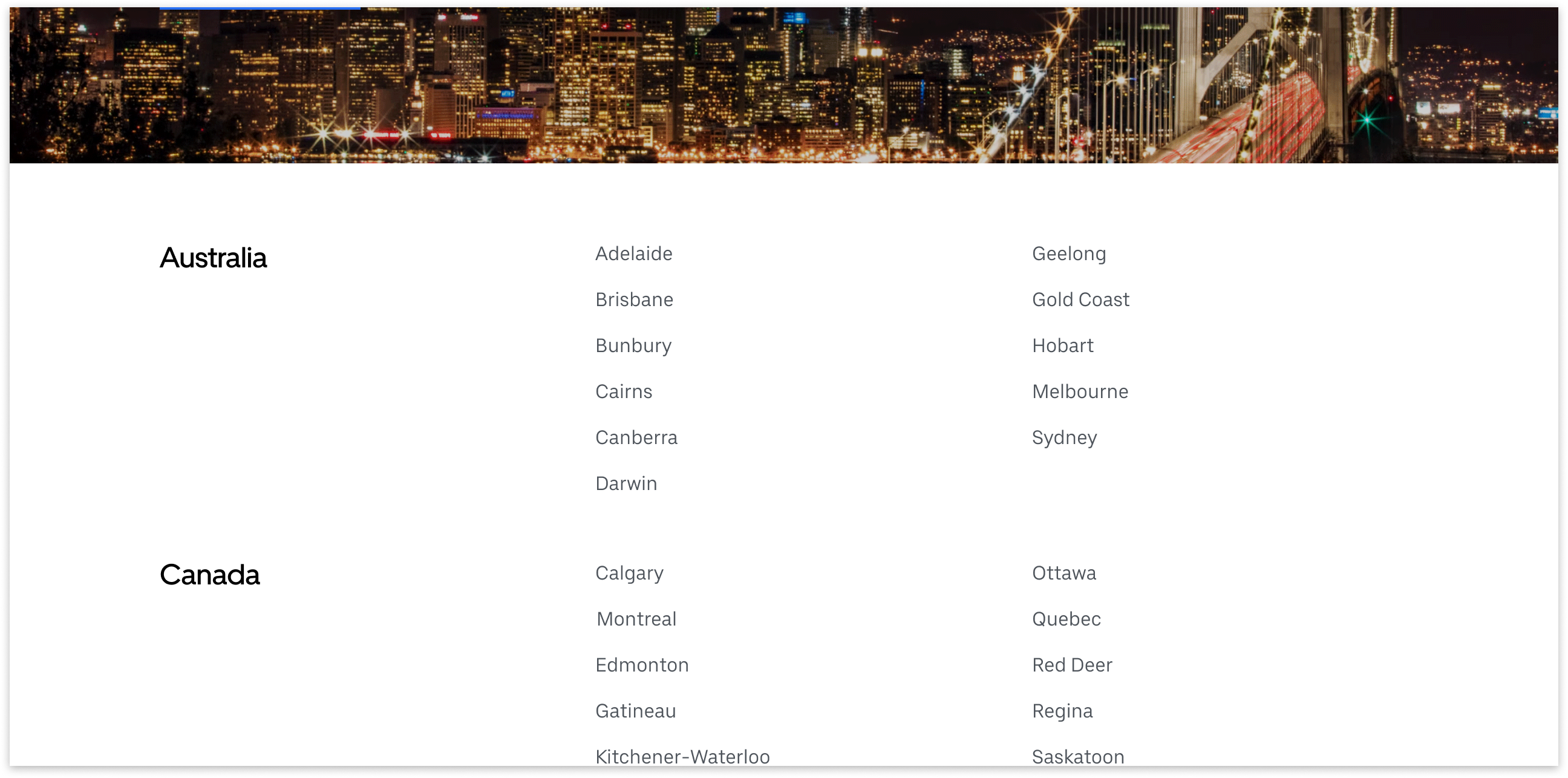
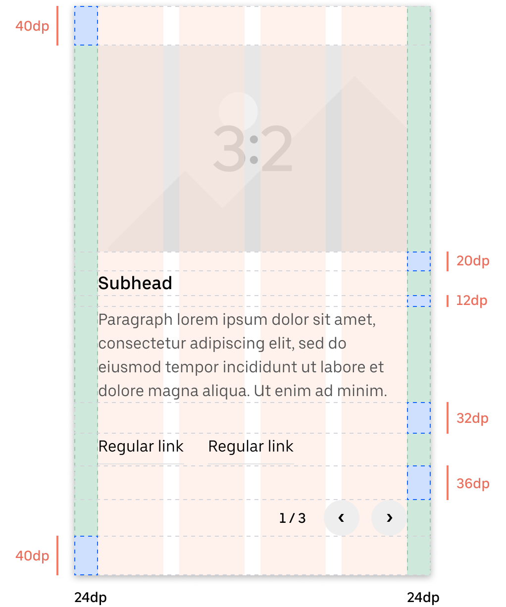
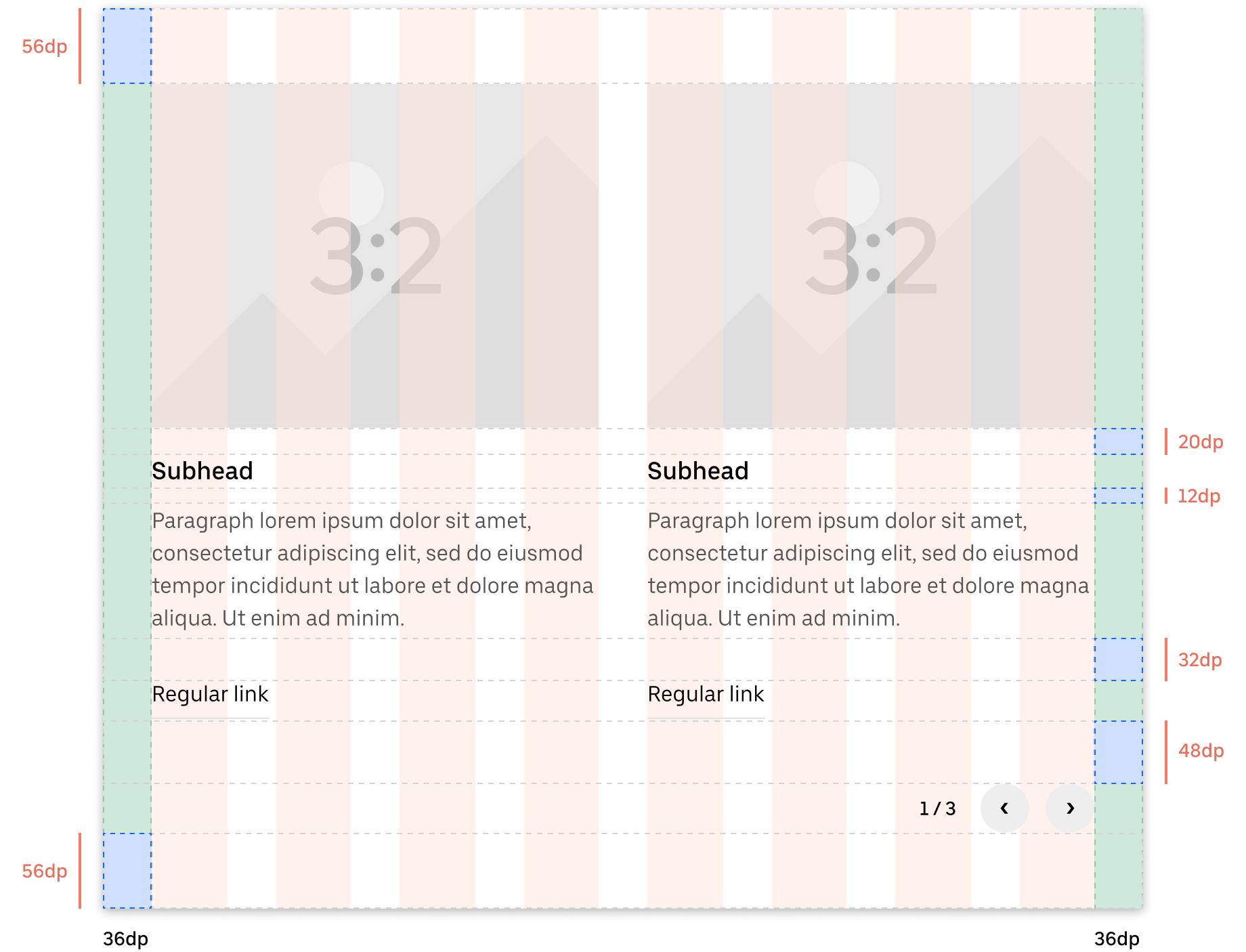
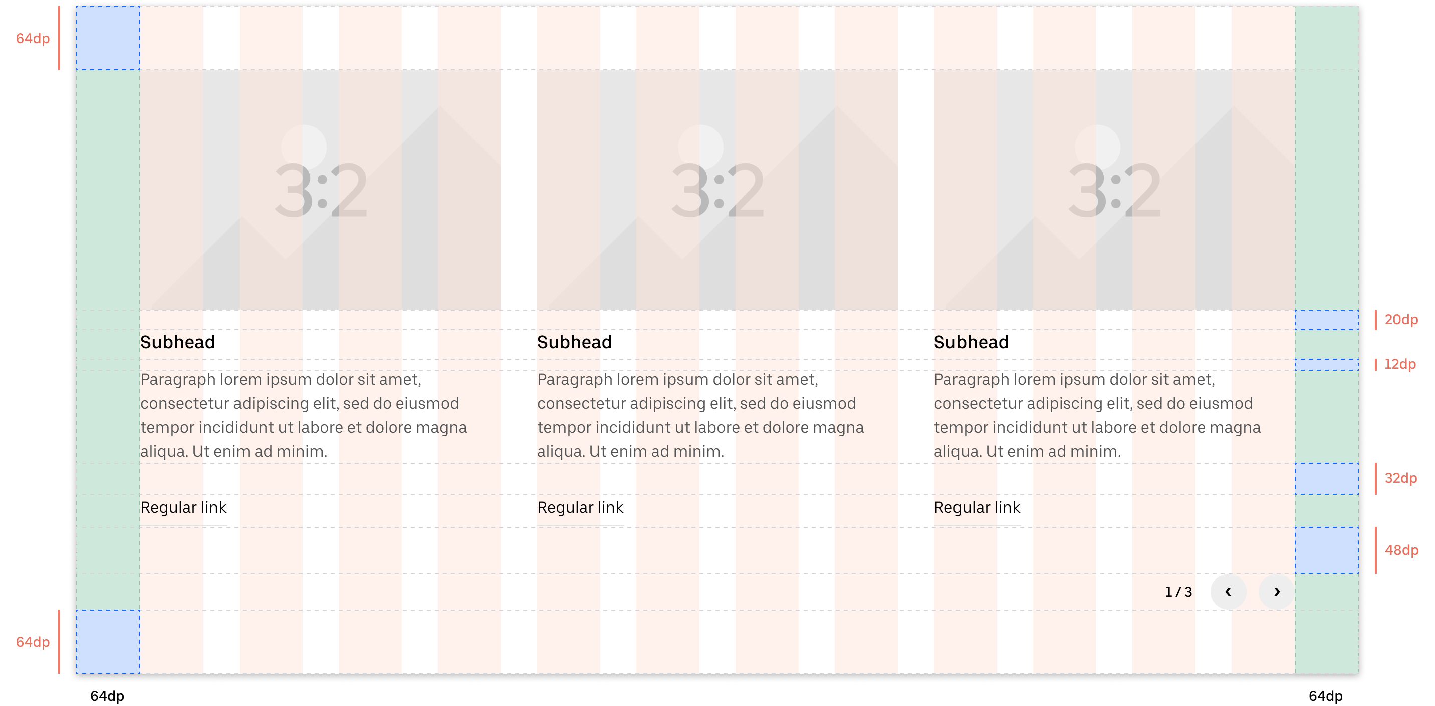
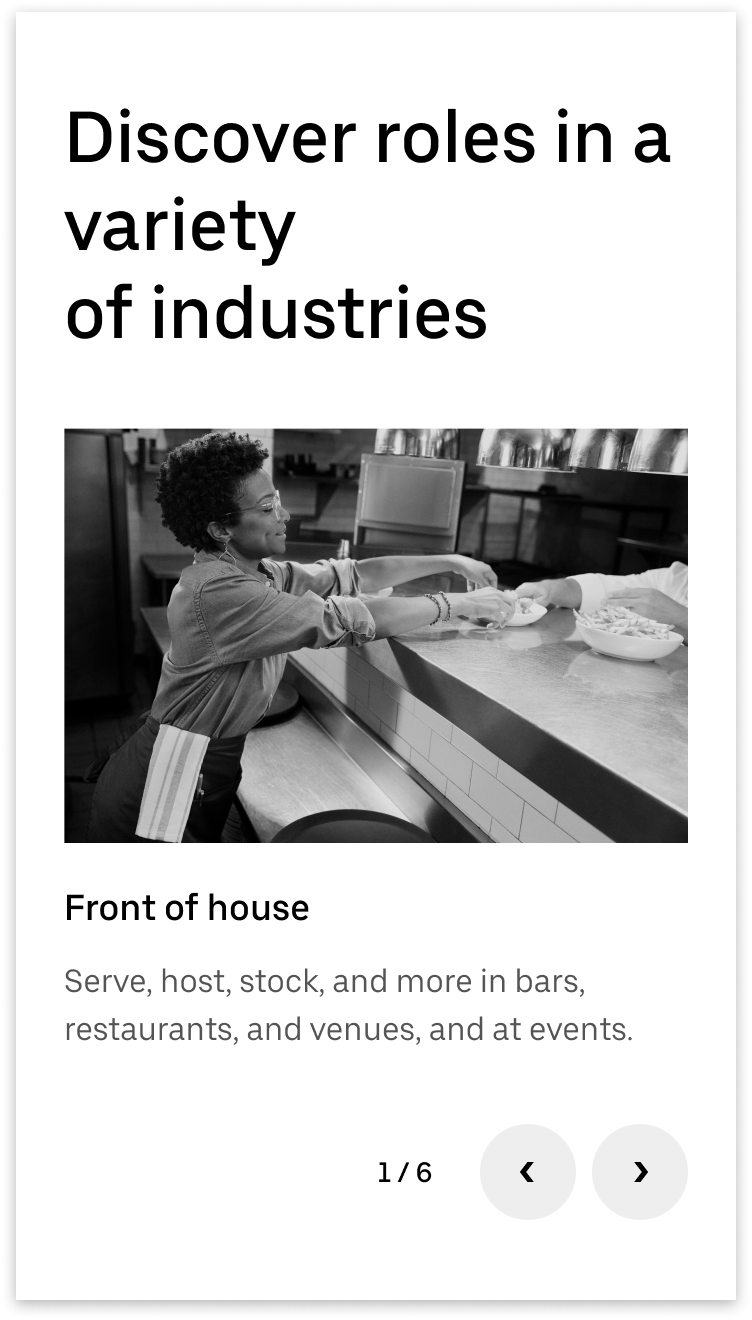
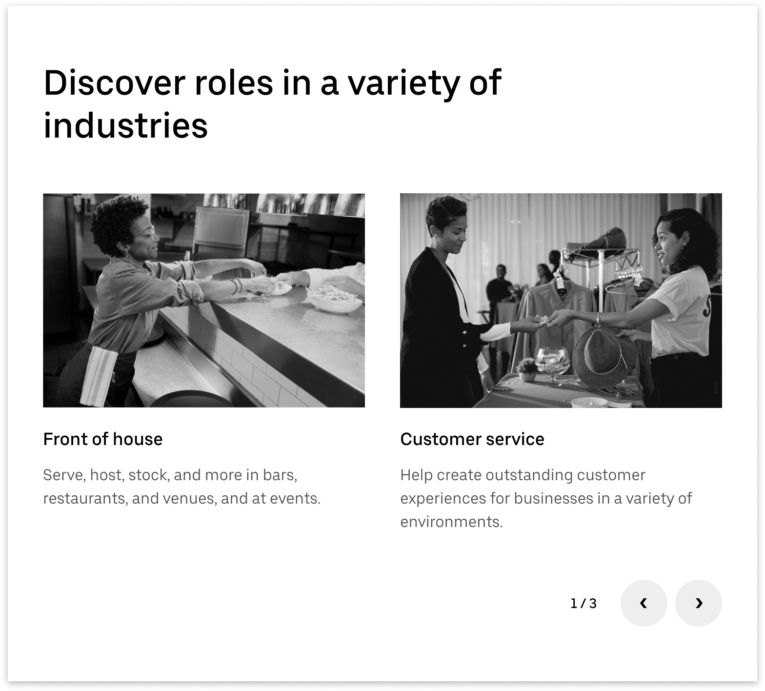
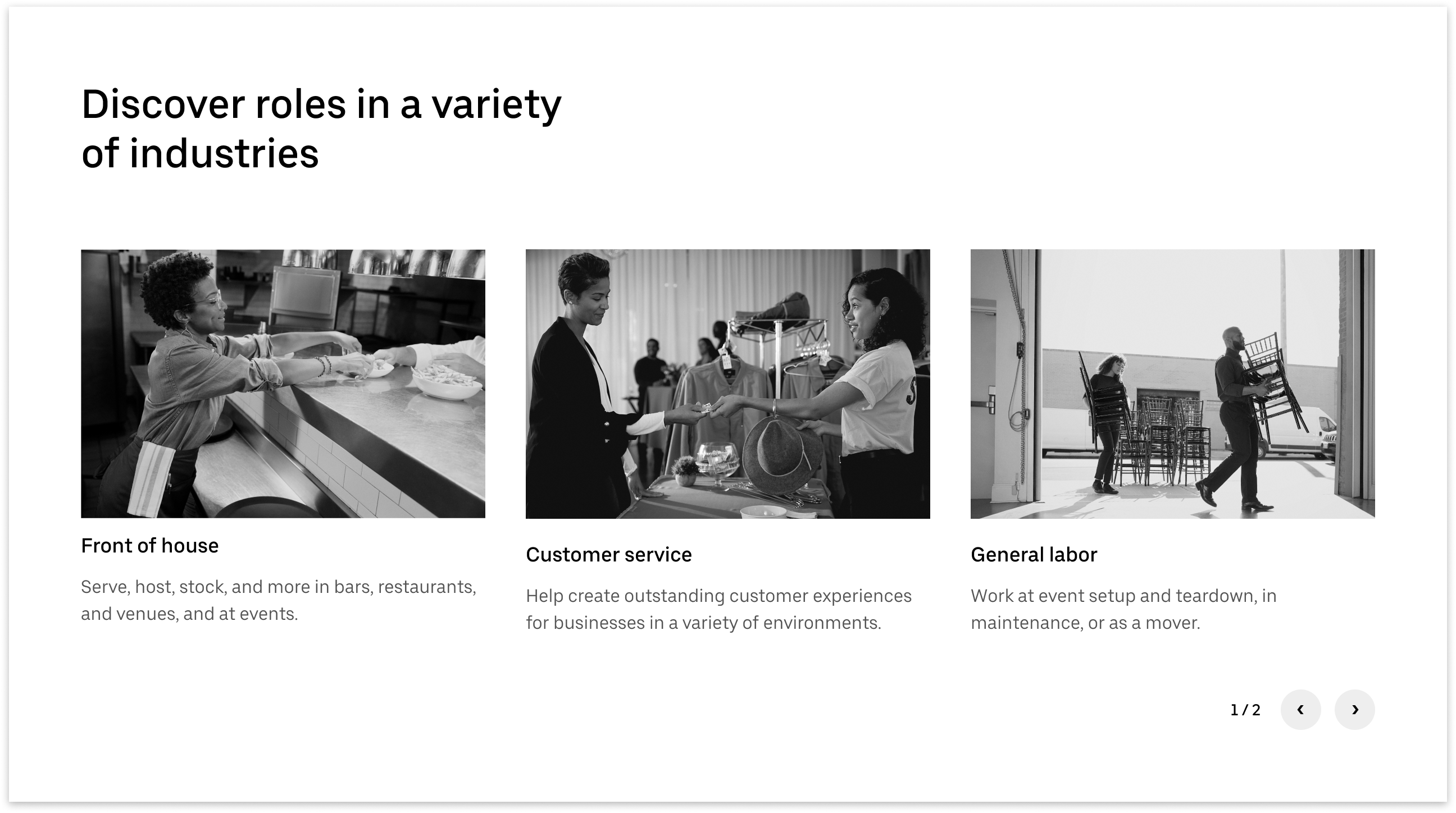
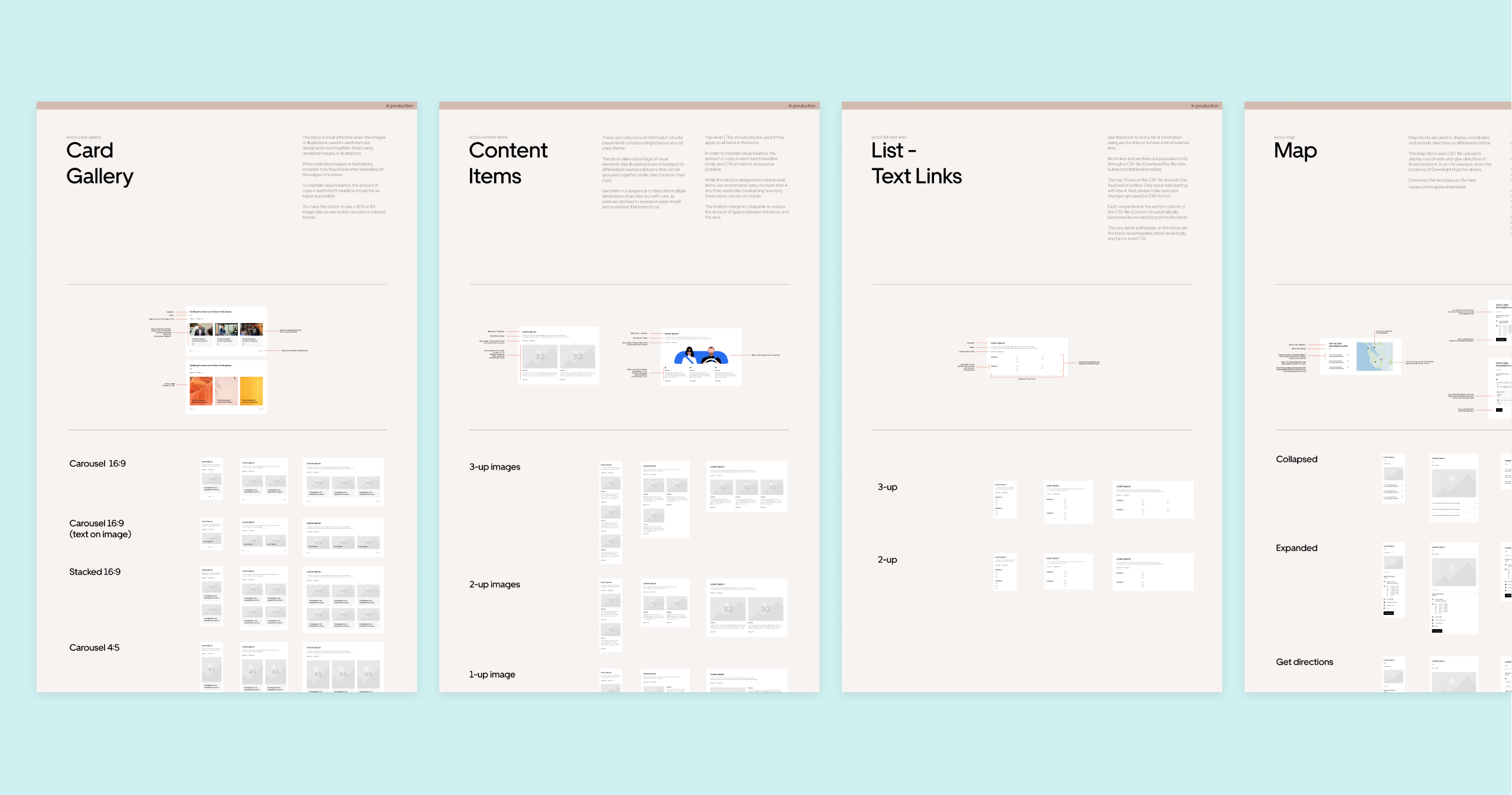
Blocks are the primary means for organizing a web page on uber.com. They are any combination of assets, components, and foundational elements. I’ve been responsible for designing new blocks and improving existing ones.
LIST BLOCK
CONTENT ITEMS BLOCK
Internal Guide for uber.com Authors
Together with another designer, I created an internal guide for Uber employees needing to author web pages for uber.com using the Samba design system. This guide breaks down the steps to design a page—from determining the page’s goal to building the page in Uber’s content management system. I led the content strategy for this guide.
This project is still in progress.
Final Thoughts
On a personal note, I love design systems. During my free time, I read a lot about them and meticulously study well-established design systems (like IBM’s Carbon design system!). There’s something satisfying about thinking systematically and knowing that I get to contribute to a system meant to streamline the way people work.
